Play Open
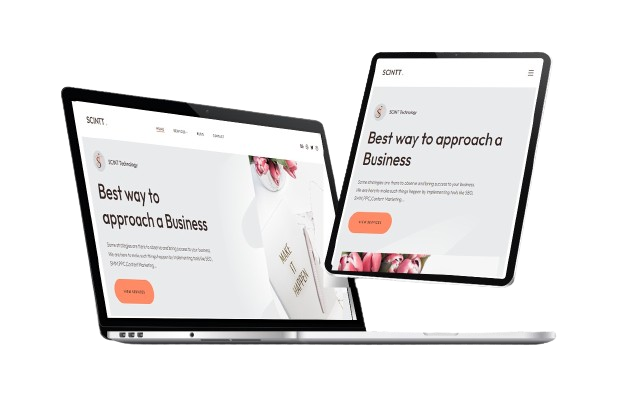
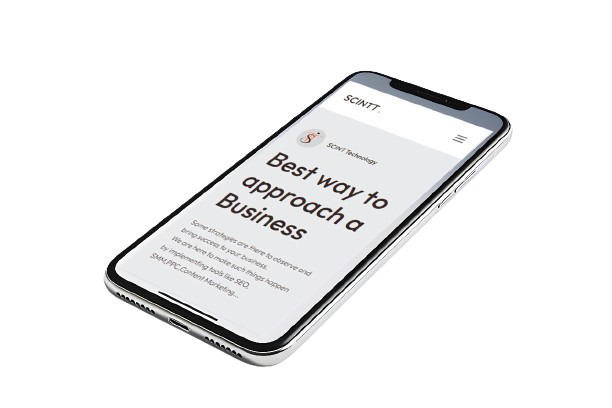
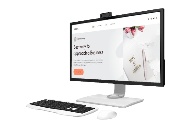
Responsive Web Design
RWD : Why it is needed?
To meet the rapid increase in mobile usage, the need of responsive web design came into prevalence. How does it work? It is used to build websites that could automatically adjust to fit any screen size, platform, orientation on any devices. The key objective of responsive web design is to emphasize the user experience, make the website faster, more accessible, better SEO-friendly, attract wider audience and easier to handle. SCINT Technology, do whatever you need for your responsive website and makes increase sales or promotions or build good relationship with your business partners.
Increase Google Rank
Lower Bounce Rate
Wider Audience
Enhances Conversion Rate
Benefits of using Responsive Web Design on your Website
Enhanced user experience
Basically, business is based on users and their experiences; here, responsive web design makes it happen by improving accessibility, optimizing images, and ensuring that they function well on all devices.
Future - Proofing
There is no need for significant web site redesign or redevelopment if your website has responsive web design. It is easily adopted and adhered to in future technical advancements and upgrades on all devices.
Faster page loading
Another important factor is speed when loading web pages; it creates a positive impact on loading pages faster and encourages users to keep browsing for a long time, which likely leads to a lower bounce rate and increases the conversion rate.
Save time and cost
It simplifies maintenance costs and saves time with the support of elements like media queries, fluid grids, and flexible visuals as compared to non-responsive web pages. In another aspect, a single version of the source code would work on all devices with different screen sizes.
TECHNOLOGY BUNDLE


SCINTT's Deliverables
- SCINTT does responsive web design using well-structured code and a standard team.
- We assure you that the output of your website will be perfect on all devices with various screen sizes.
- We would deliver the site after multiple responsive tests using tools like BrowserStack, CrossBrowserTesting, or the built-in browser developer tools.
- We would optimise speed as well as responsiveness.
- Our deliverables are based on customers’ products and services.